-
invitaciones de boda
Briefing
Eli & Pablo were married on October 10. They wanted their wedding to be a big party, designed for all friends and close family, so everybody will enjoy with them this special day, they had long been preparing.
Concept
When they told us how they wanted to be their invitations, there were many references to cheerful and colourful, nothing pompous or exaggerated things.
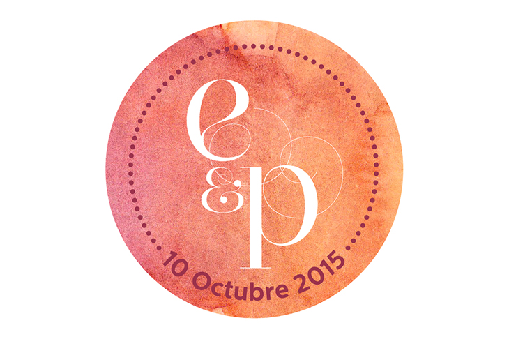
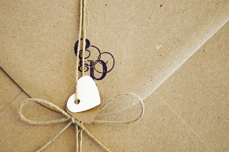
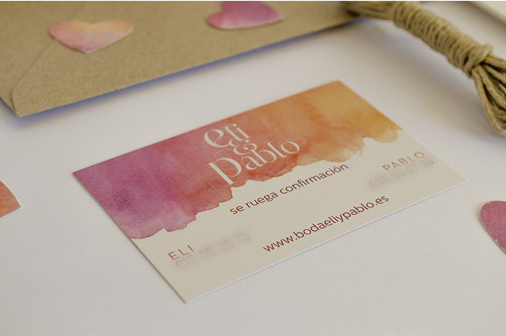
In the final result all the elements come together in an envelope Kraft paper with a stamp anagram: E&P.
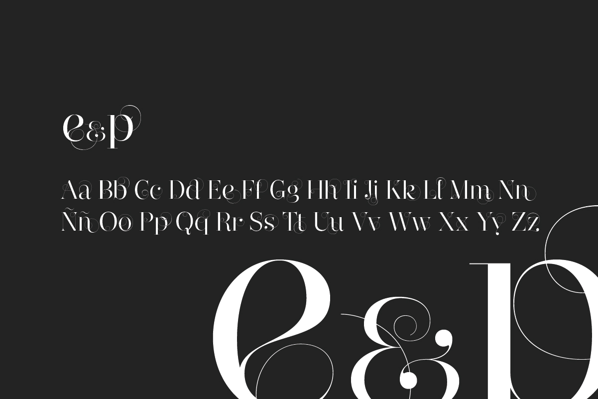
Typography
The typeface chosen is Narziss Swirls, an ornate Didone. Thanks to its delicate finials has been able to build the perfect monogram with the initials of the bride and groom, which produces the sensation of being both letters intertwined and thus enhance the idea of union link.
Narziss Swirls
Colours
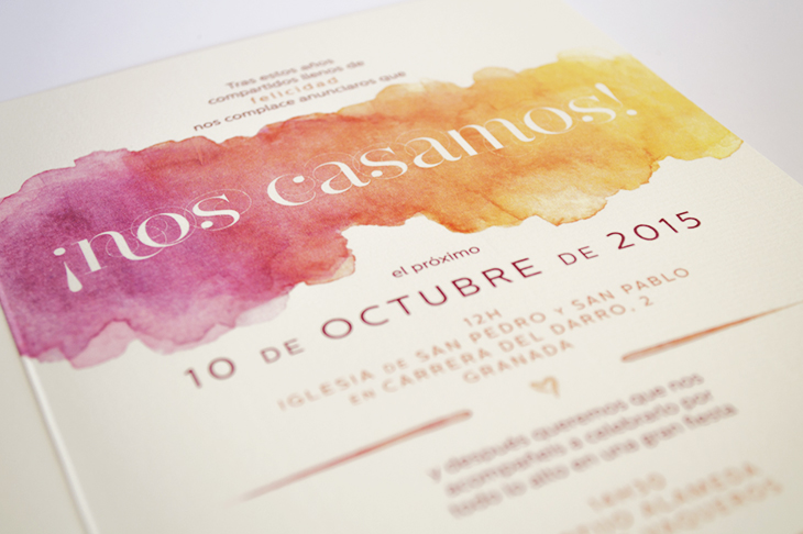
As a wedding which took place in the autumn, colour range is based on warm orange and purple. It evokes the sensation of a sunset, and flowers and fruits of this time of year: pumpkin, lilacs, hydrangeas, leaves of trees...
-
Pale Yellow
RGB: #fccb85
-
Burgundry
RGB: #941947
-
Light Orange
RGB: #dd7550
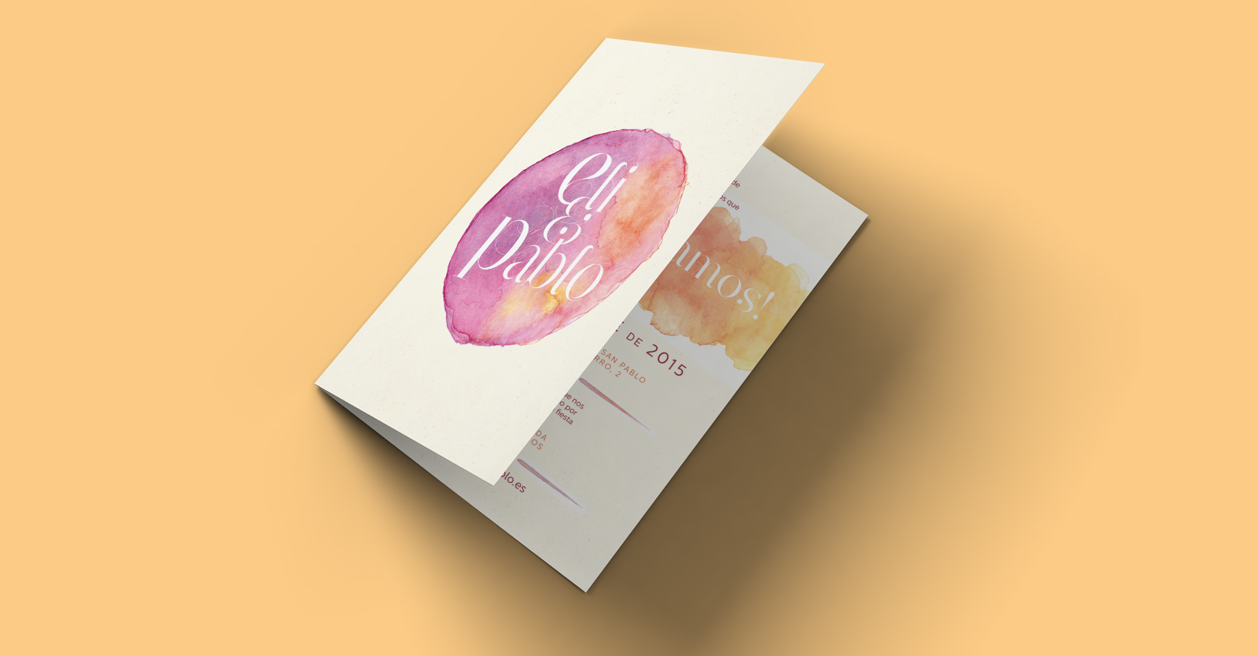
Final art
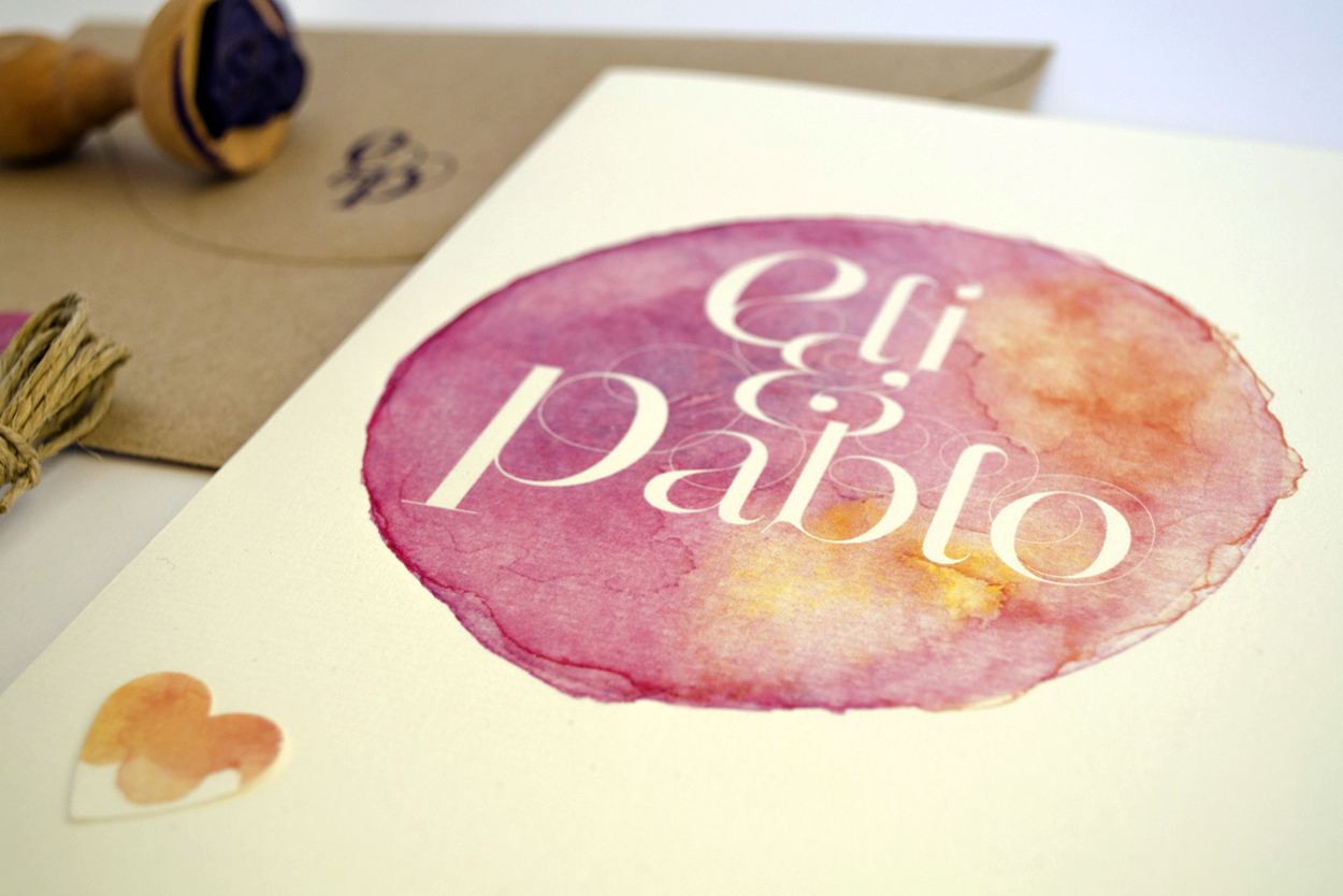
Thus it came to this design: diptych A5 laid paper with watercolour coloured cover with its anagram and explanatory text on the inside.
Corporate identity
Below you can see images of the final art of the invitation:
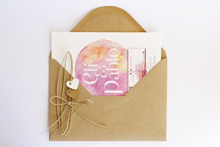
Complete invitation
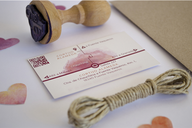
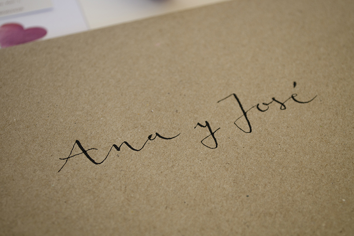
It consists of the invitation and a card with the contact information of the couple and the map with the details of the place where the wedding was held. The envelope is Kraft paper stamped with the seal of anagram in purple ink, with the guests names handwritten with nib pen.
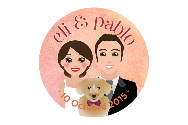
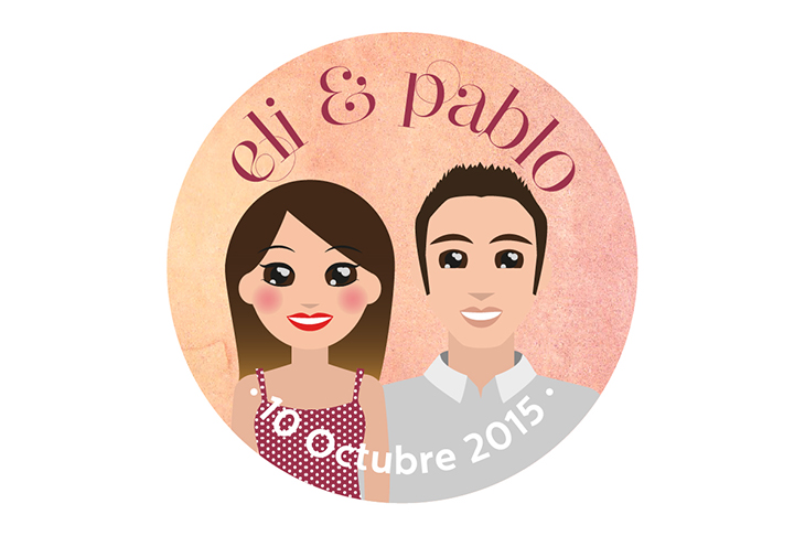
Illustration of the couple
Pin button badges were also handed with illustrations of the couple with their dog Rocky and the anagram wedding.