-
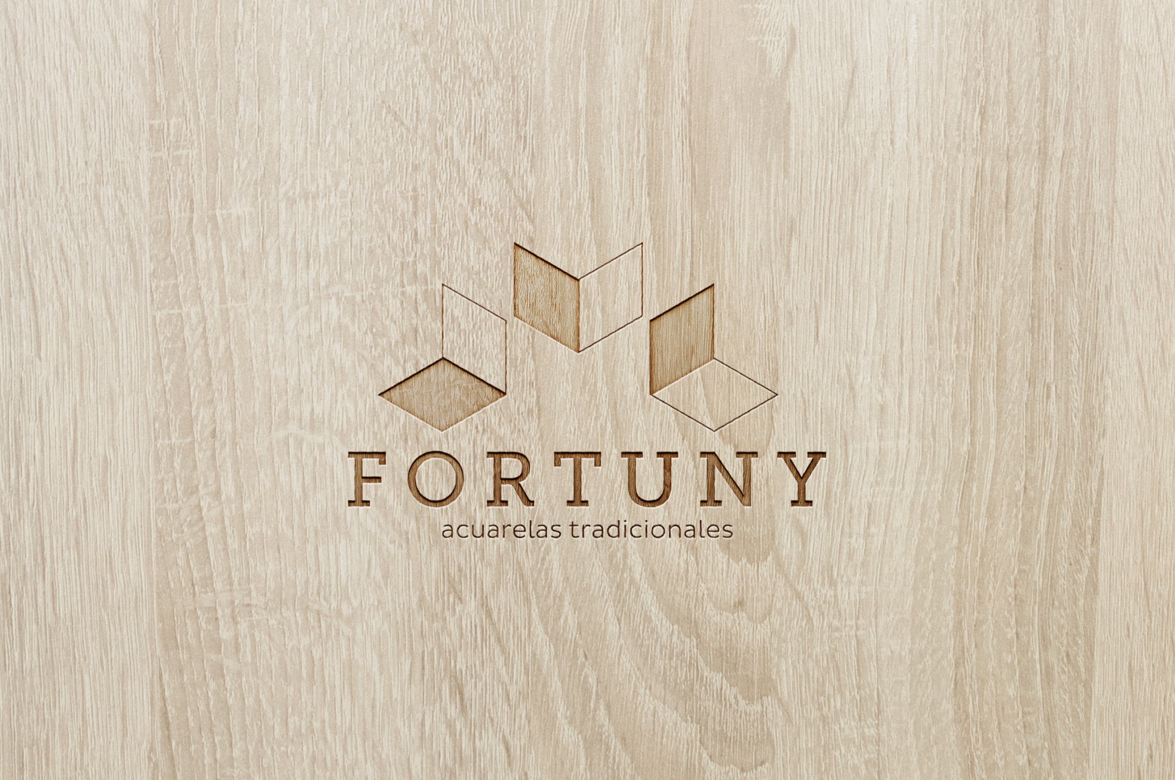
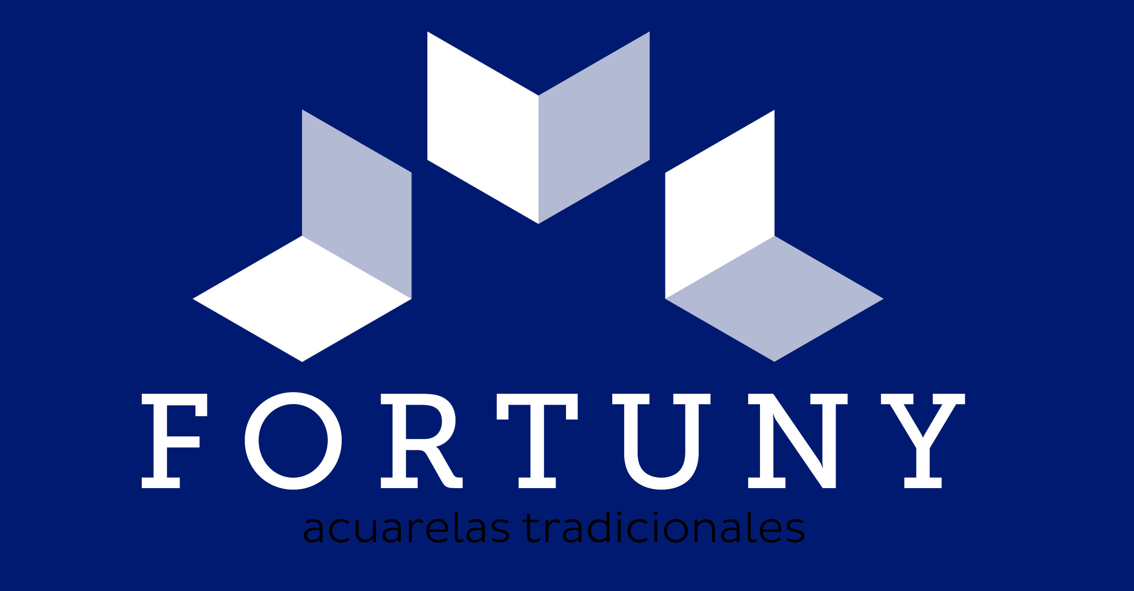
Fortuny
Briefing
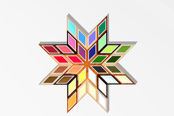
It is a watercolours’ brand, based on the craftsmanship of Granada: marquetry. This technique consists of forming stars or isolated figures for embedding various materials on wood.
Concept
The design of fretwork and arabesque motifs contrast with the colour of the bottom plate. They are the same as in the 14th and 15th centuries were used in the decoration of furniture, ceilings and vegetal Arab plaster decoration of the Alhambra.
It is formed with geometric strips of wood and different materials. They glued together from the inside out and leave coupling layers until the desired design. The finish can be glossy or matte.
Typography
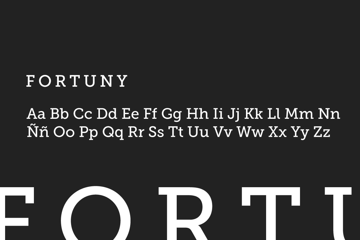
The main corporate typeface is Museo Slab, which consists of a robust Egyptian typeface, used in capital and high kerning, which endows the whole of sophistication and stability. It is the best choice for a brand associated with the art world, with the name of a great painter as Fortuny.
Museo Slab
Colours
The corporate colour is ultramarine blue, as it was considered one of the most valuable colours by plastic artists, due to the difficulty to get it, because it was imported from Asia by sea.
-
Ultramarine
RGB: #001a71
-
Light Blue
RGB: #b2bad4
-
White
RGB: #ffffff
Naming
The naming refers to Mariano Fortuny, considered along with Eduardo Rosales as one of the most important Spanish painters of the 19th century after Goya.
Prototype
To construct the logo it has been considered the minimum unit used in the preparation of marquetry.
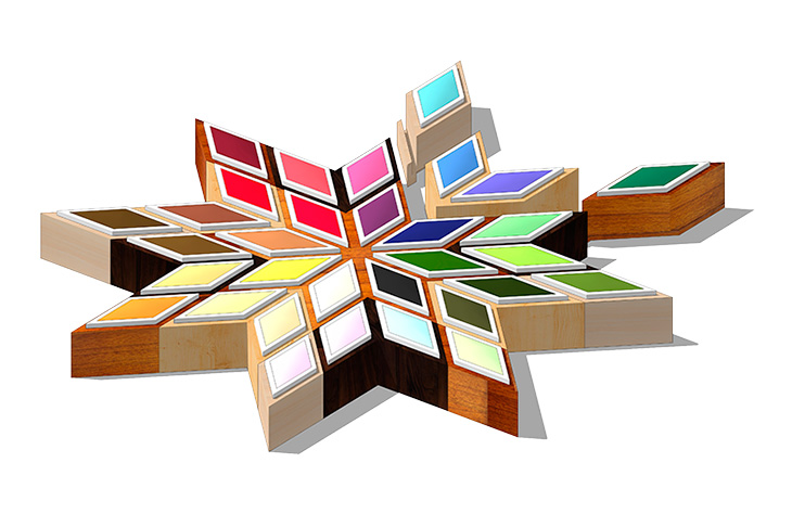
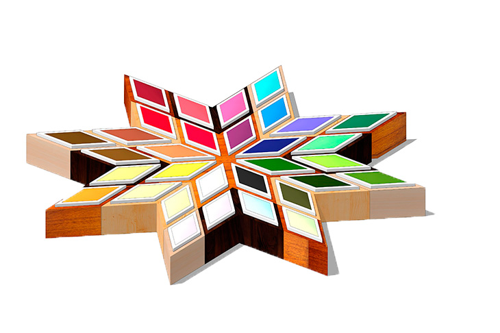
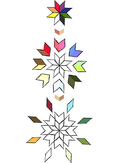
Box of watercolours
The watercolour box is also based on the shape of the arabesque motifs of inlaid wood. It consists of a first module with the basic colours, to which he can go coupling parts, to form a larger collection of colours as shown in the following scheme.