-
royal services
Briefing
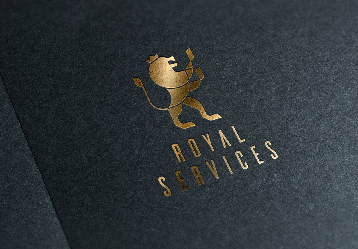
This project started as a restyling of the logo of a real estate company. Once the necessary improvements were made, it began the development of a corporate web.
Concept
The logo consisting of an illustration of a heraldic lion style. It did not work well as a logo because it had too much detail, which prevented it to be easily be remembered and recognized. Keeping the basic structure, a more geometric lion is built with few elements.
Typography
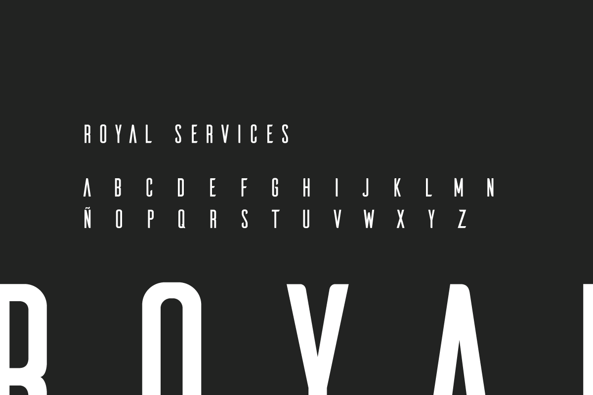
In contrast to such a classic element as a royal heraldic lion, a futuristic typography air is chosen: Ailerons. It is very slender and elegant, which helps to reinforce the idea of sophisticated brand.
Ailerons
Colours
Blue as corporate colour remains, because it reinforces the feeling of calm and confidence to be transmitted. The secondary colour is grey, which is less contrasted that if a black is used and works well on the whole.
-
Blue
RGB: #d42326
-
Grey
RGB: #e5c9b5
-
White
RGB: #ffffff
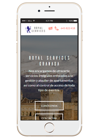
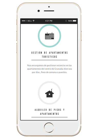
Self-managed web
The web design is based on the technique of parallax succeeding all sections as we scroll.
This work is done using Wordpress for inclusion and modification of content by administrators.
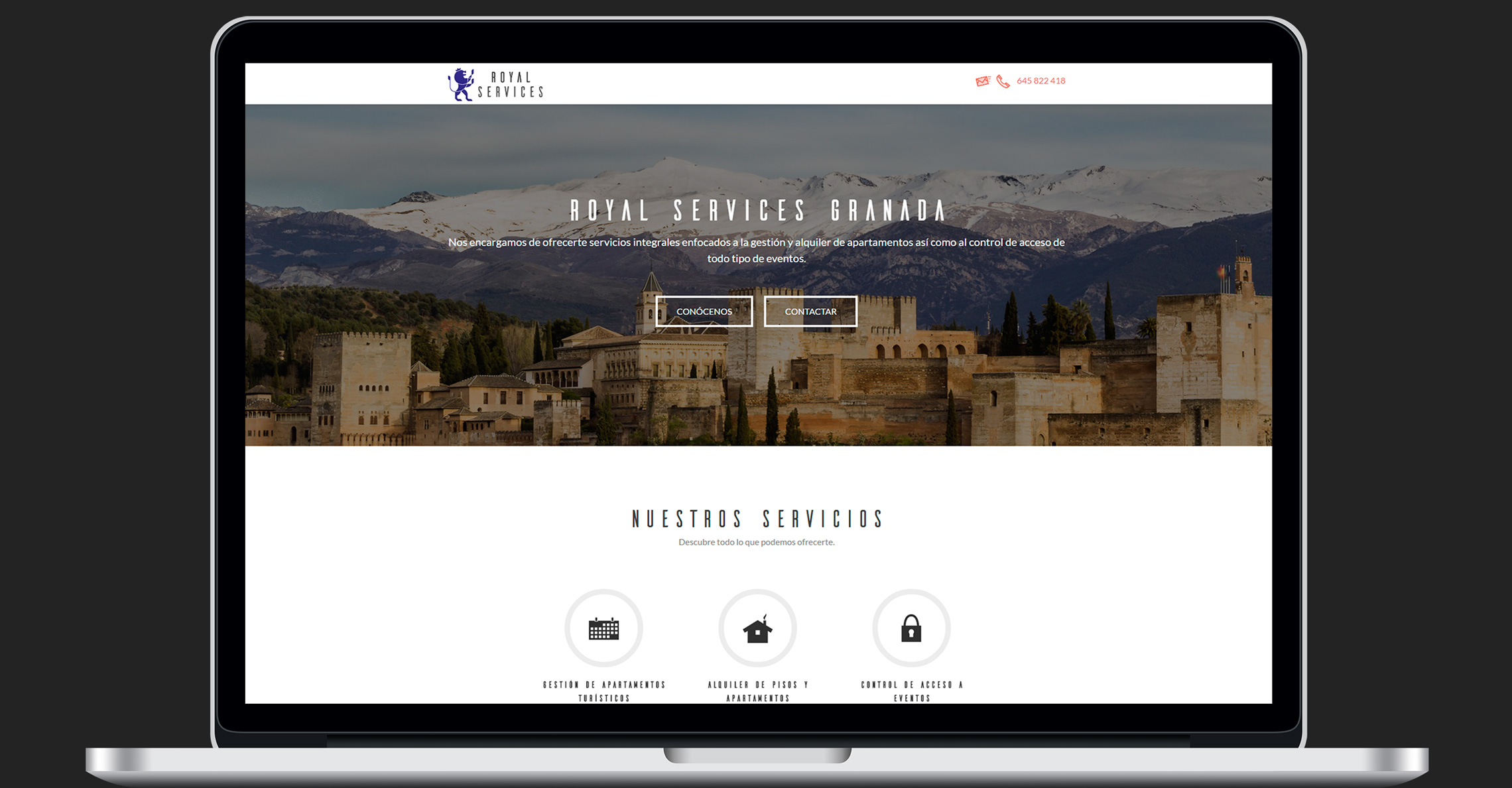
Responsive
One of the objectives was to adapt as well as possible to as many mobile devices, essential today because every time the user traffic from them is greater.
Views
Views of web design in different mobile devices.