-
granacontrol
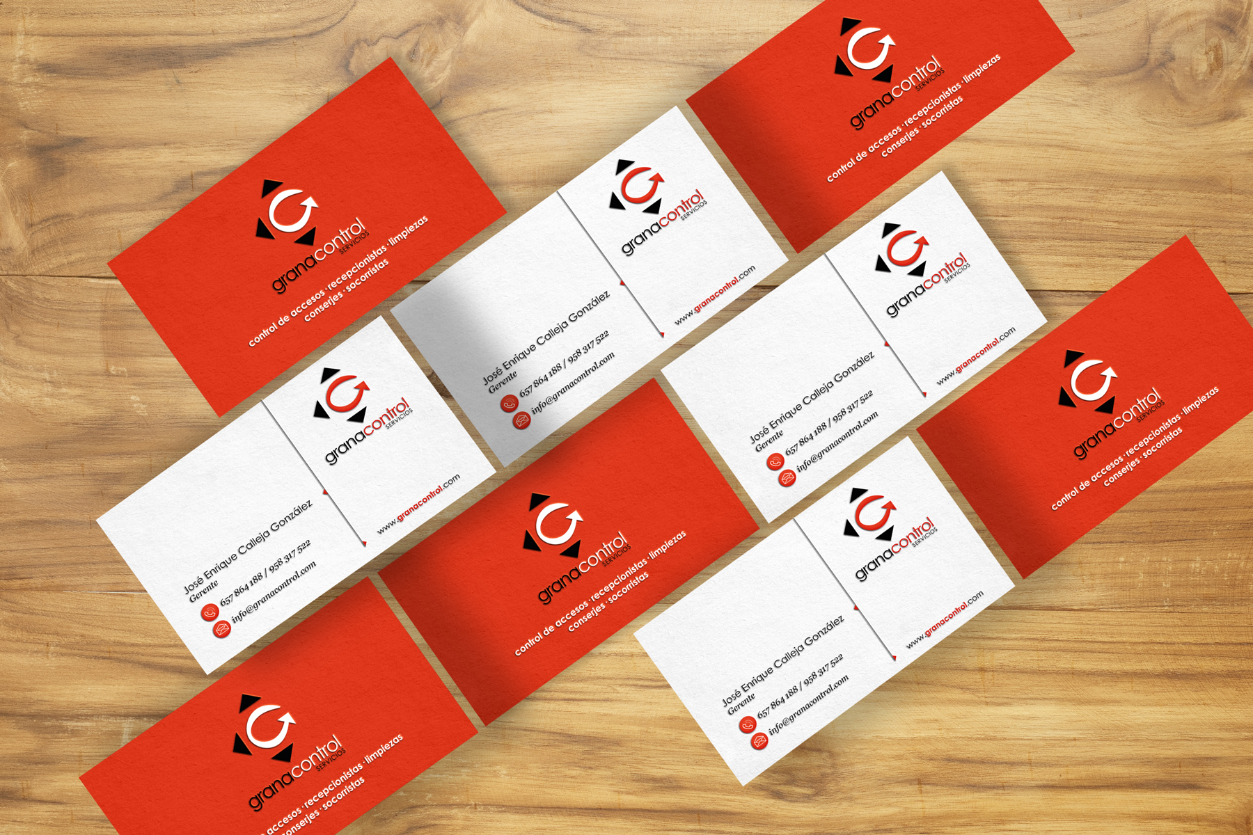
Briefing
This project started as a review of the logo and other elements of the corporate identity of this service company of Granada. Once the necessary improvements were made, we started with the development of a new corporate website.
Concept
The key premises of the restyling of Granacontrol have been the continuity of the most recognizable elements of the logo and corporate colours, while redundant elements were removed.
Thus, the logo is constructed as a wave which forms the “G” of Granacontrol, surrounded by the three arrows that add directionality and strength to the whole.
Colours
Corporate brand colours are maintained. Red conveys a sense of action and courage and black adds elegance.
-
Black
RGB: #000000
-
Red
RGB: #e5c9b5
-
White
RGB: #ffffff
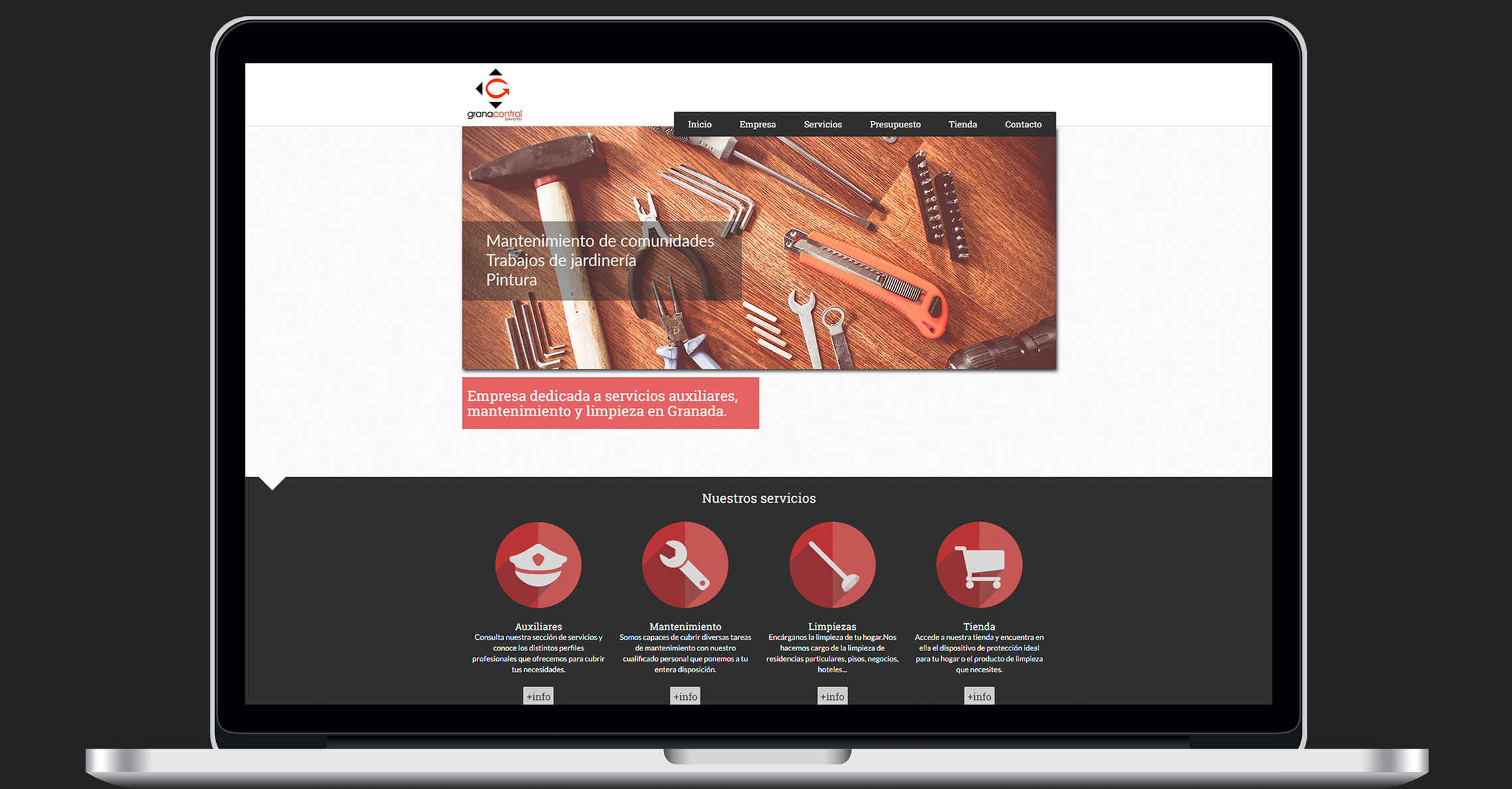
Corporate website
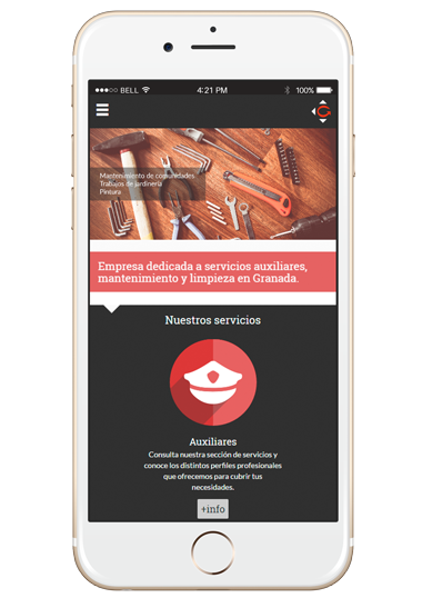
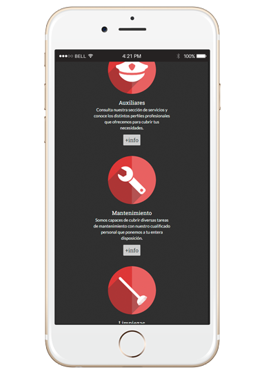
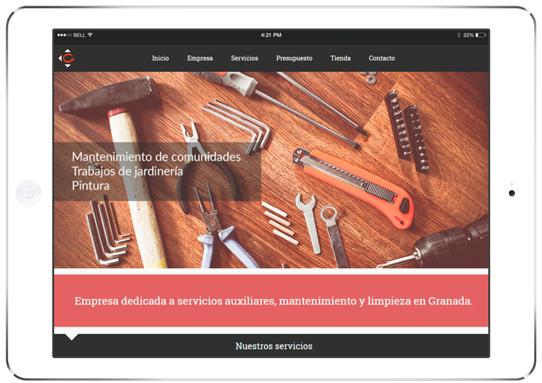
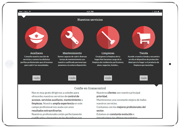
The web consists of 5 sections and plans to expand in the future with another section dedicated to online store.
The work was done previously sketching on paper and graphics programs and then was developed using languages like HTML, CSS, JavaScript and PHP.
Responsive
One of the objectives was to adapt as well as possible to as many mobile devices, essential today because every time the user traffic from them is greater.
Views
Therefore, the design performed three versions: mobile, tablet and desktop (the latter in the image above).