-
juliana
Briefing
This project meet the need to create a corporate identity for a brand of gourmet organic products. It is a smart company, at the same time friendly and contemporary which will determine the development of corporate identity.
Concept
The logo is built on the premise of representing on a calligraphic form a fruit or vegetable.
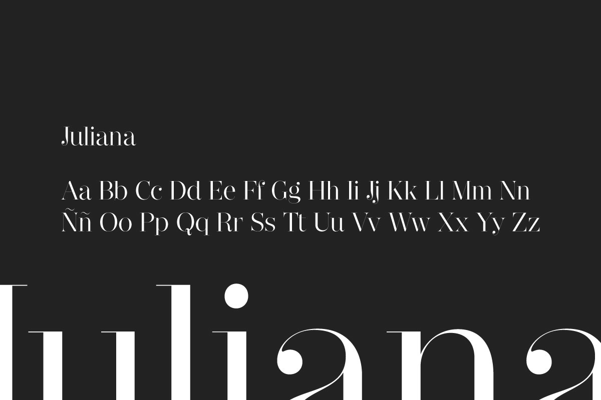
Typography
The main typography is Egyptian, Didone type, with high contrast and curved spikes in lower case. His great height makes it easy readability typography while elegant.
The typography used in “Gastrobar” is very rounded. The combination of both typefaces project the philosophy of the company to the outside communications. It is a smart company, at the same time friendly and contemporary.
NARZISS
Colours
The green colour that is associated with the natural and organic, and therefore a sought ambiguity is generated when trying to recognize what vegetable is represented.
-
Light Green
RGB: #2d9543
-
Burgundy
RGB: #8c2638
-
Dark Green
RGB: #398245
-
Light Brown
RGB: #b78945
-
Violet
RGB: #9976a3
-
Orange
RGB: #ec7f39
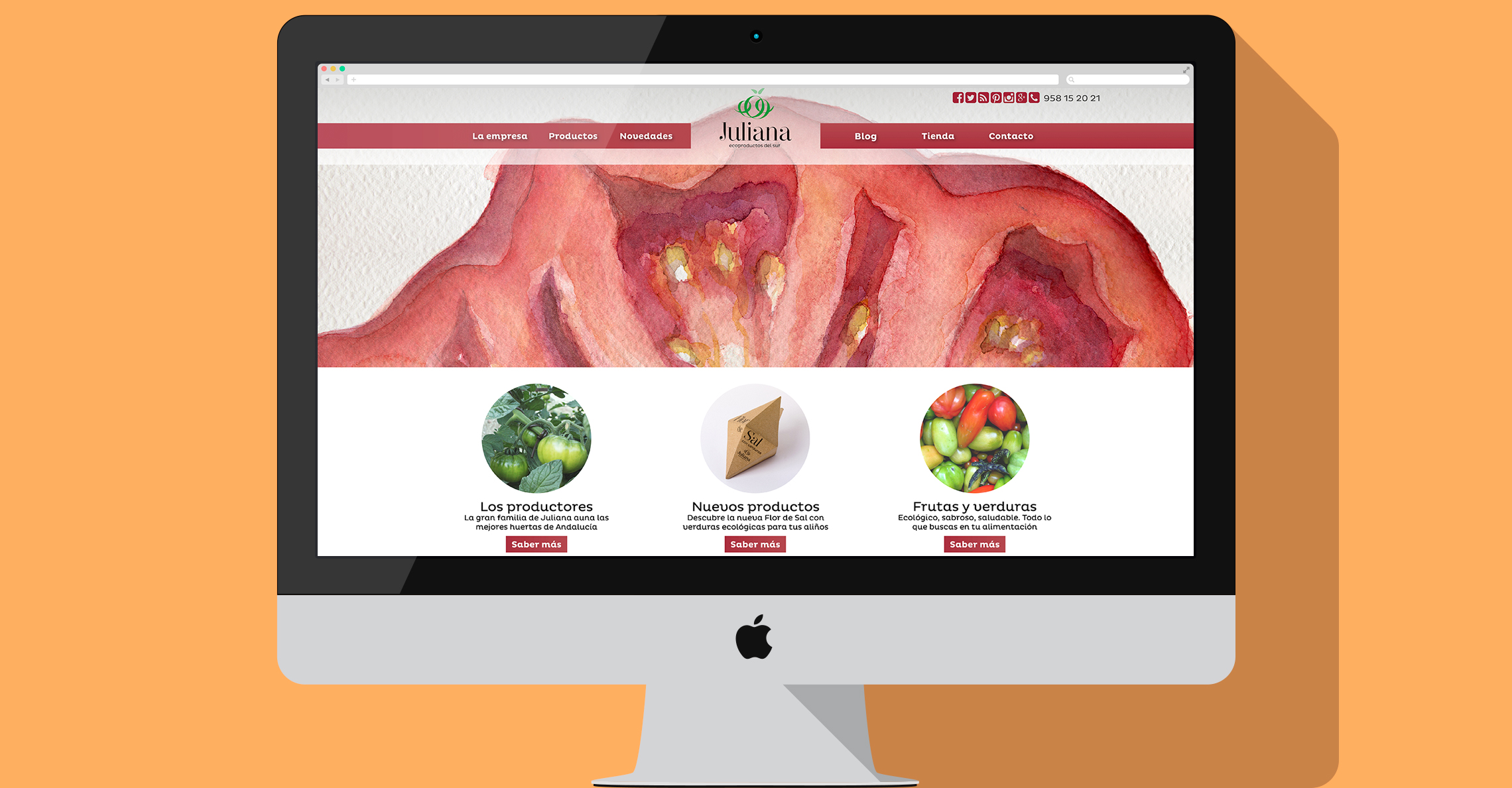
Web design
The web page and online store is designed full screen with images representing the brand. The structure is centred giving importance to the logo in the header, with easy access to all the information required by the client.
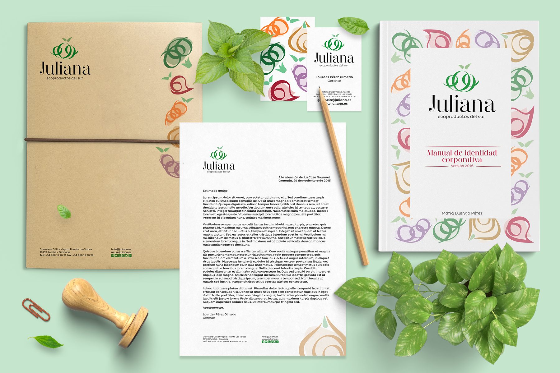
Corporate identity
All the elements are designed to complement the brand: advertising, merchandising, stationery and own specific elements.
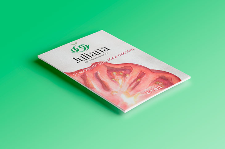
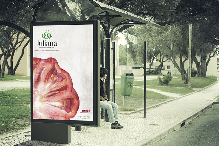
Advertising
The idea of gourmet brand is highlighted by associating their products with a masterpiece. All graphic is complemented with watercolour illustrations of organic vegetables Juliana offers.
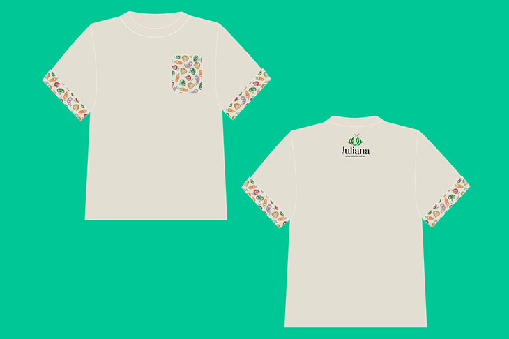
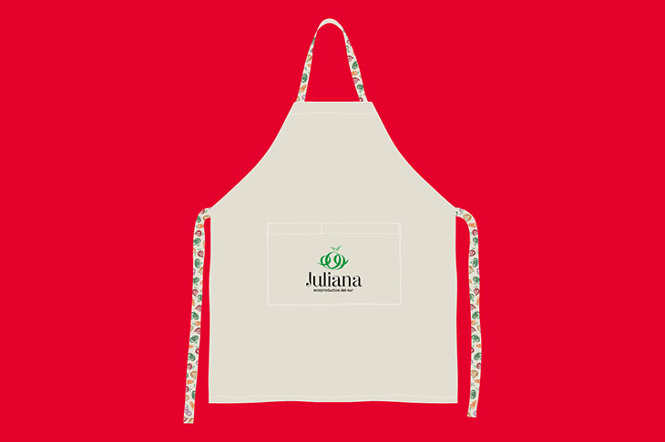
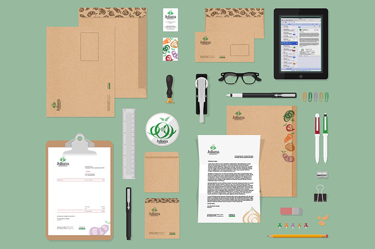
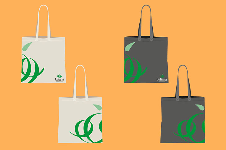
Stationery and Merchandising
Stationery is built by using the developed graphic resources for the brand: letters, envelopes, CDs ... with a common thread that enhances the brand. Specific merchandising is also designed for consumers of organic fruit and vegetables such as apron and reusable bags for shopping.