Briefing
The project consists of a logo design and advertising elements for a new fertilizer.
Concept
Neo is a range of fertilizer products developed jointly between Herogra and the US multinational brand: Koch.
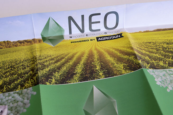
The logo is based on the teardrop that forms the anagram of the Herogra brand, but reinterpreting it in the shape that generates the crystallization of the raw materials that make the products.
Typography
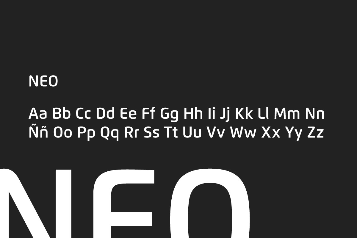
As for typography, Flexo family is used. Its rounded corners give the feeling of contemporary and friendly, while stable.
Flexo
Colours
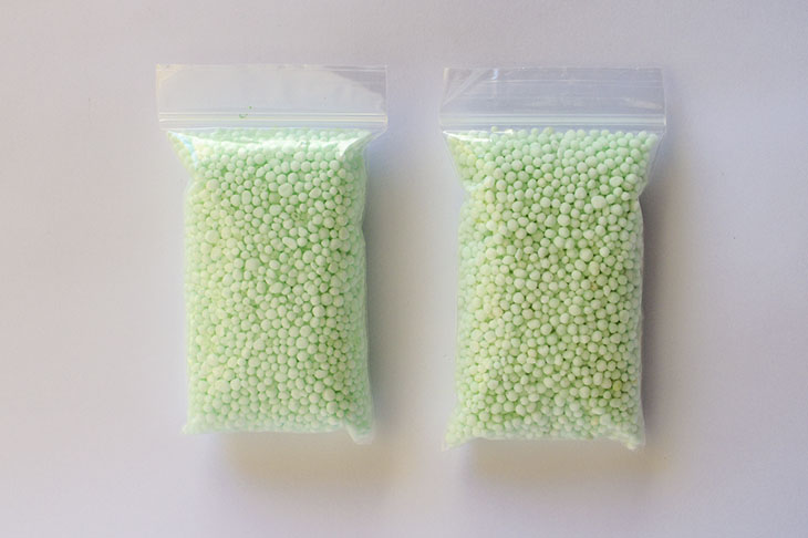
The choice of green is due to the appearance of the product itself, as the novelty regarding other fertilizers is determined by a particle called NBPT, which has a subtle green. And it works organically, increasing the potency of the product and as a result have to use less of it, reducing its respective impact on the environment.
-
Green
RGB: #009e45
-
Green Light
RGB: #a1e3bb
-
Charcoal
RGB: #000000
Packaging
The graphics resources of the brand are applied to the different packaging of this product, that consist of fertilizer pellets that are sold in bags of 25Kg tube and Big Bags.
It can also be seen the product colour, which is what has been used for the entire identity.
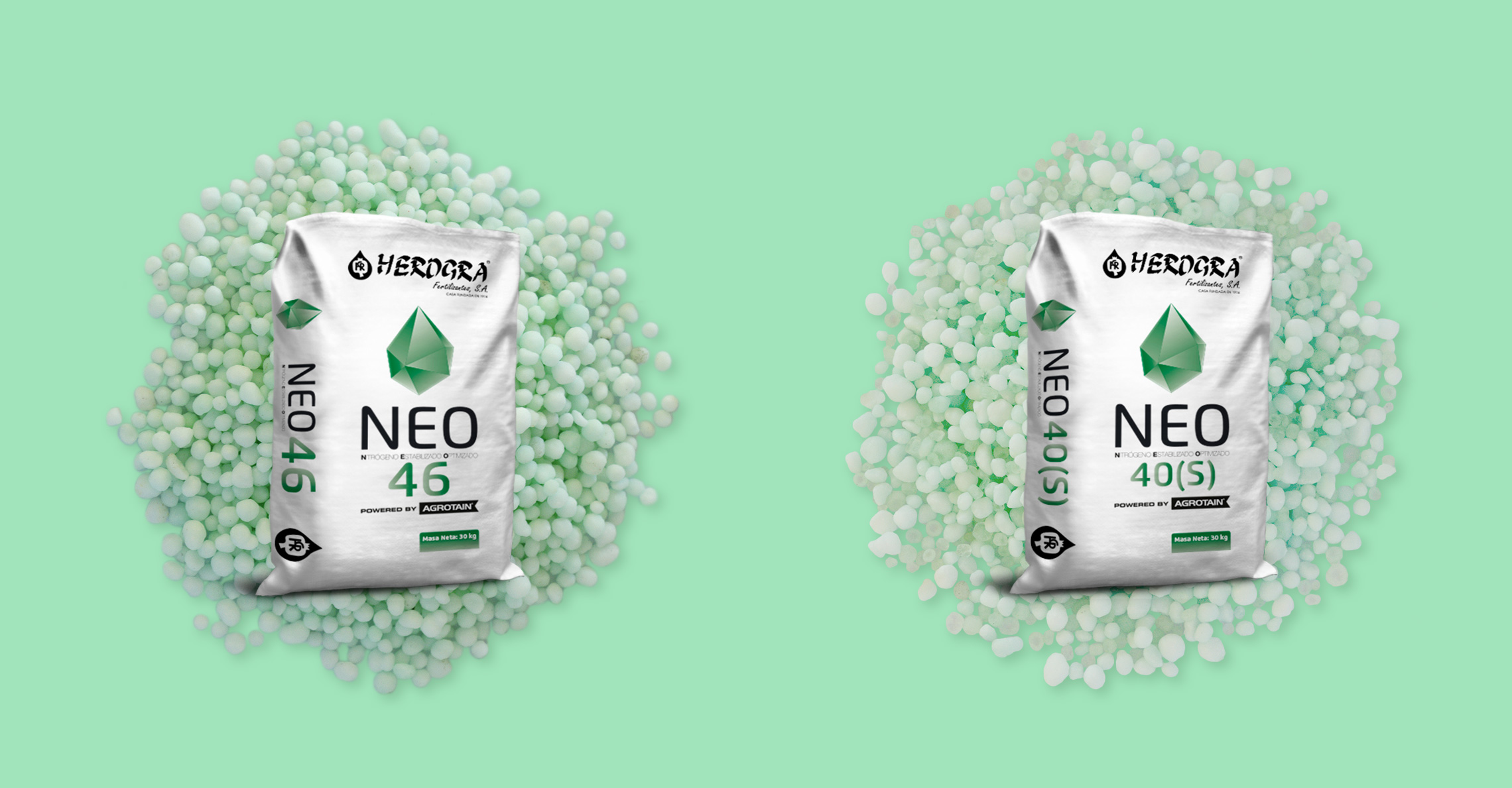
Final art
Below you can see images of the final art of the corporate identity:
Advertising
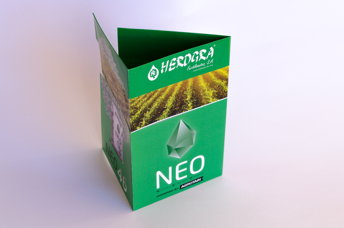
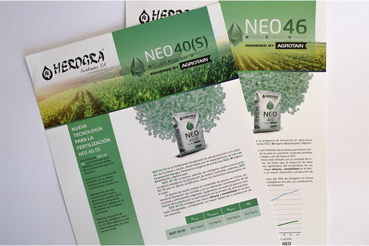
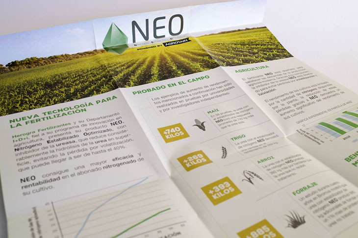
Several brochures, in which the product characteristics are described, are made following the editorial line of Herogra in all of them, while maintaining the unity of the corporate identity of NEO. A folding brochure of the NEO range is also designed.
Product samples
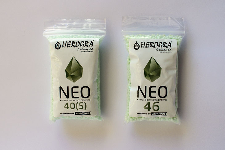
The packaging of the product samples are also designed to be handed to customers.


