-
Amsterdam

Briefing
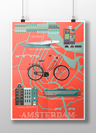
Making a poster of a European city with vector graphics.
Concept
Amsterdam is a very special city for me because I was fortunate to live in it some time. It is a city that seduces because while it is a cosmopolitan, global city, is welcoming. It is relaxed because people are happy going anywhere cycling. It is contemporary because it is at the forefront of Europe in architecture and art.
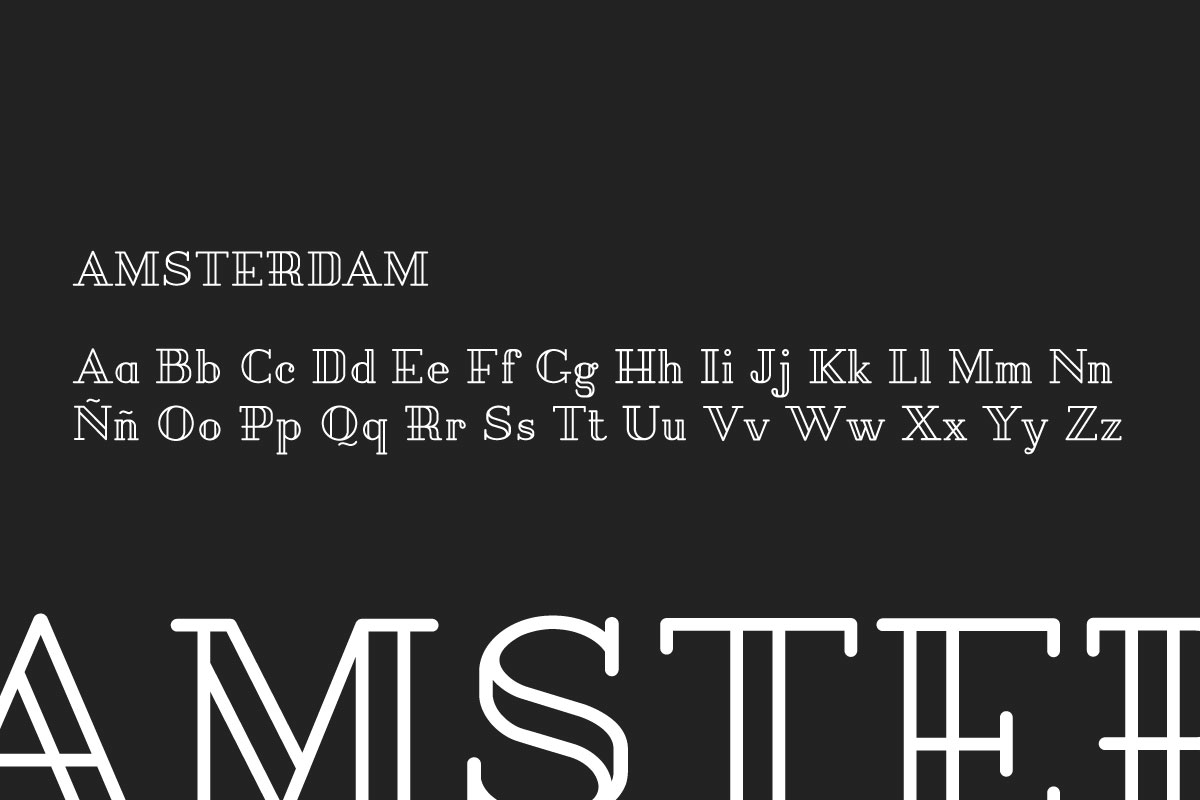
Typography
Pirou typography is used, a slab display typeface for headlines which has a sailor air which agrees very well with the city. It is also a bit rough and geometric, which also gives unity to the entire poster as it was mostly built with geometric elements planes.
Pirou
Colours
The colour palette is deliberately contrasted, including red light, saturated blue and garnet so that the whole will be more striking. They also give a sense of vintage that is reinforced with Old School style typography.
-
Red Orange
RGB: #E85743
-
Garnet
RGB: #993233
-
Teal
RGB: #47857F
-
Teal Light
RGB: #9EB9AD
-
Grey
RGB: #BAB1A9
-
White
RGB: #ffffff
Illustration
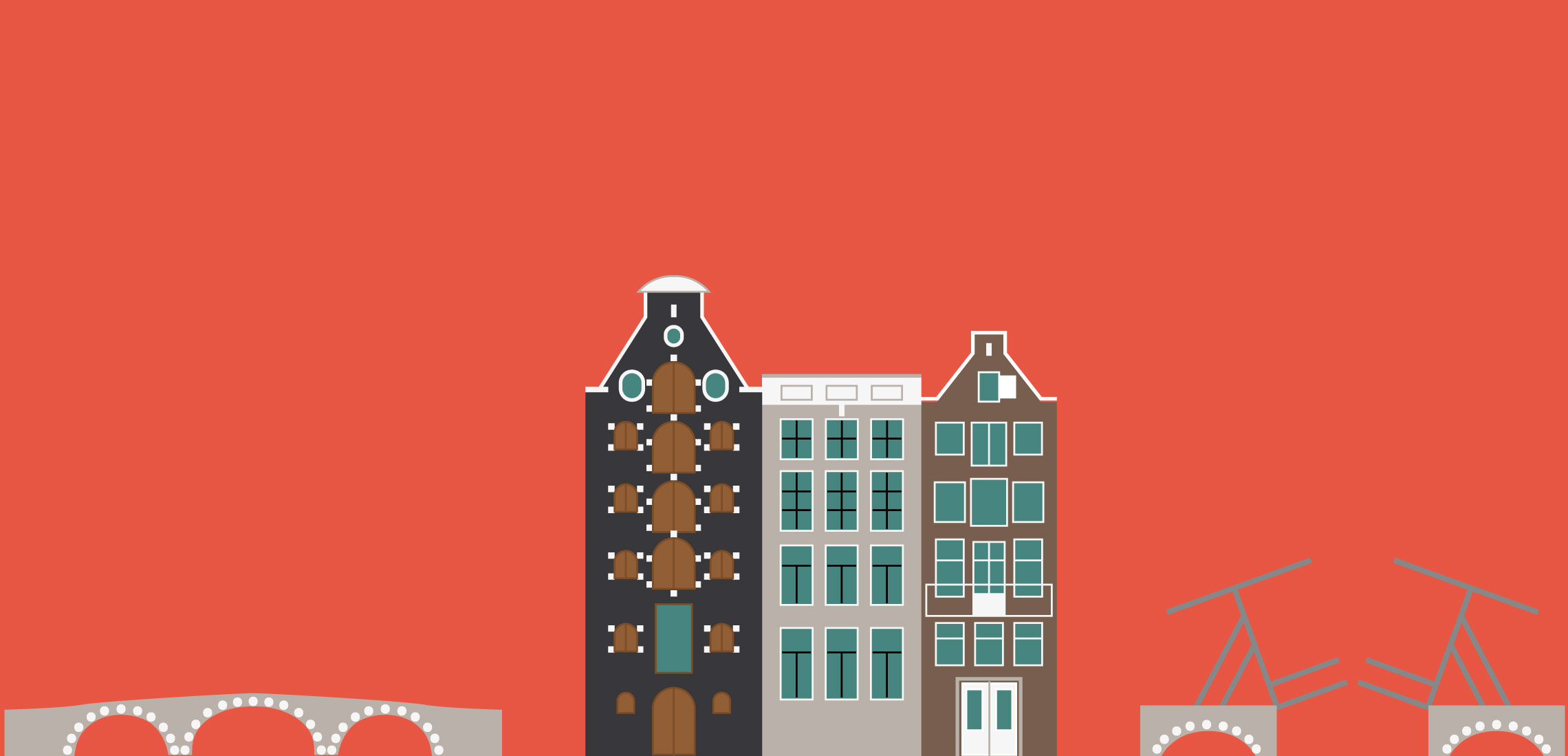
All the poster is constructed with simple forms that conforms the layout of the city and its buildings.
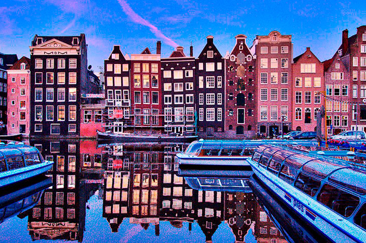
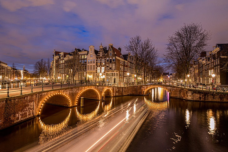
If you come to recognize their beautiful houses overlooking the canal and bridges it is that the geometry has paid off.
Conclusions
Then you will see in detail the references and the final elements of the poster.

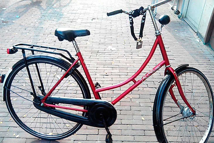
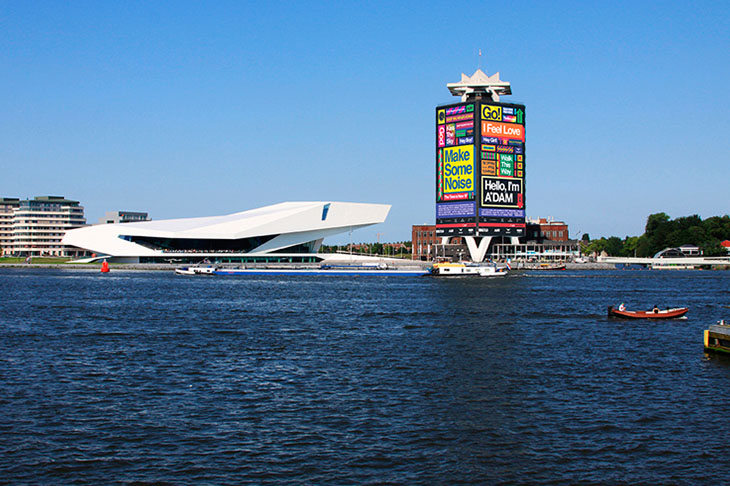
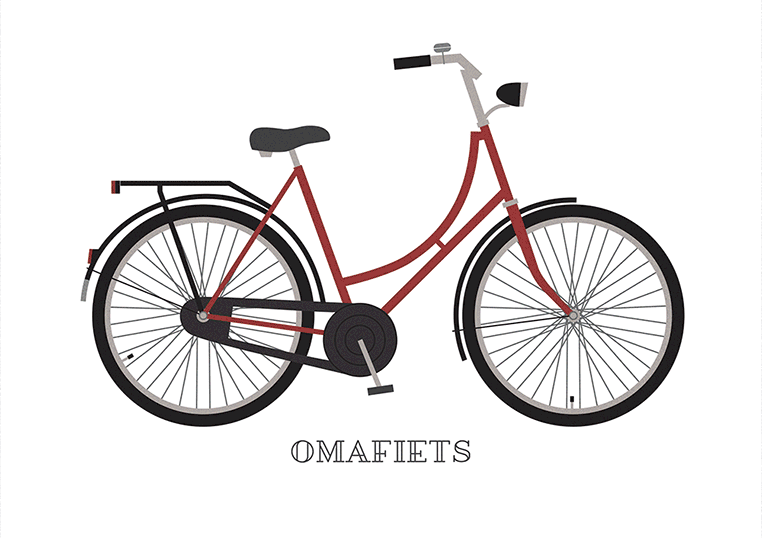
My dear omafiets, who stayed in good hands. The spectacular Silodam of MVRDV: vigilante huge mass of all traffic of the IJ bay. EYE Filmmuseum and Adam Toren neighbours, who at that time was covered. The Stedelijk Museum and finally, most typically Dutch: canal houses.